Patients First
Exploring the impact of long wait times in hospitals in Canada, and proposing an effective solution to tackle the problem space
My Role: UX Researcher, UX/UI Designer
Team: Individual, Mid-fidelity Course project
Duration: 3 weeks
Tools: Figma
Designed for: iOS & Android mobile


Introduction
Long wait times in hospitals have been a persistent and concerning issue in Canada for many years. Patients often have to wait for hours or even days to receive the medical attention they need, which can lead to worsened health outcomes and increased stress for both patients and healthcare providers. The problem of long wait times has many underlying causes, including a shortage of healthcare professionals, inadequate infrastructure, and complex bureaucratic processes. In this case study, we will examine the impact of long wait times in hospitals in Canada and explore potential solutions to address this pressing issue.

Problem Space
Despite having a publicly funded healthcare system, emergency patients in Canada often face long wait times for appointments and procedures, which can result in a decline in their health and well-being. 1 out of 3 Canadians reported waiting 4+ hours at the emergency room.
Secondary Research
Research Objective
The purpose of this research is to find causes and possible solutions for the issue of long wait times in hospitals.
27.4 Weeks
The median wait time for treatment in Canada for the year 2022
42% of Canadians
Waited 2 hours or more at the emergency room
$6.4 billion
The amount in lost wages and productivity due to wait times per year

User Interviews & Insights
In order to better understand the problem, I conducted interviews with 3 people who have access to healthcare in Canada and have visited the emergency room in the last 6 months.
From these interviews, I found the following pain points and frustrations were common across all interviewees:
Patients were frustrated by not knowing how much longer they had to wait.
Patients felt helpless and anxious while waiting.
They waited because they felt like it was their only choice.
They anticipated a long wait time before even going in.
The most compelling theme and most common pain point was the frustration of not knowing how much longer they had to wait to be attended to.
Design Challenge
From the interview insights, the design challenge became apparent. The challenge/HMW statement was created from a combination of the common pain points and goals of the interviewees.
How might we improve communication to make wait times less frustrating for emergency patients in Canada in order to improve patient experience and ensure general high quality healthcare delivery?
User Persona
My user persona captures the pain points, goals and motivations identified in the interviews.
Task Flow
The task flow is made to be simple and linear because of the nature and functionality of the app. In the case of a health emergency, it will be easier for a user to complete simple tasks and not worry about secondary flows in order to get help as soon as possible.
Exploratory Sketches


Wireframes
This was a mid-fidelity project, so the design solution could only be taken from low to mid fidelity. After the low fidelity wireframes, I conducted 5 user tests to see how potential users would interact with the product. After studying their patterns and listening to their feedback, I did a revision of the product and brought it to the final fidelity level based on the requirement of this project.


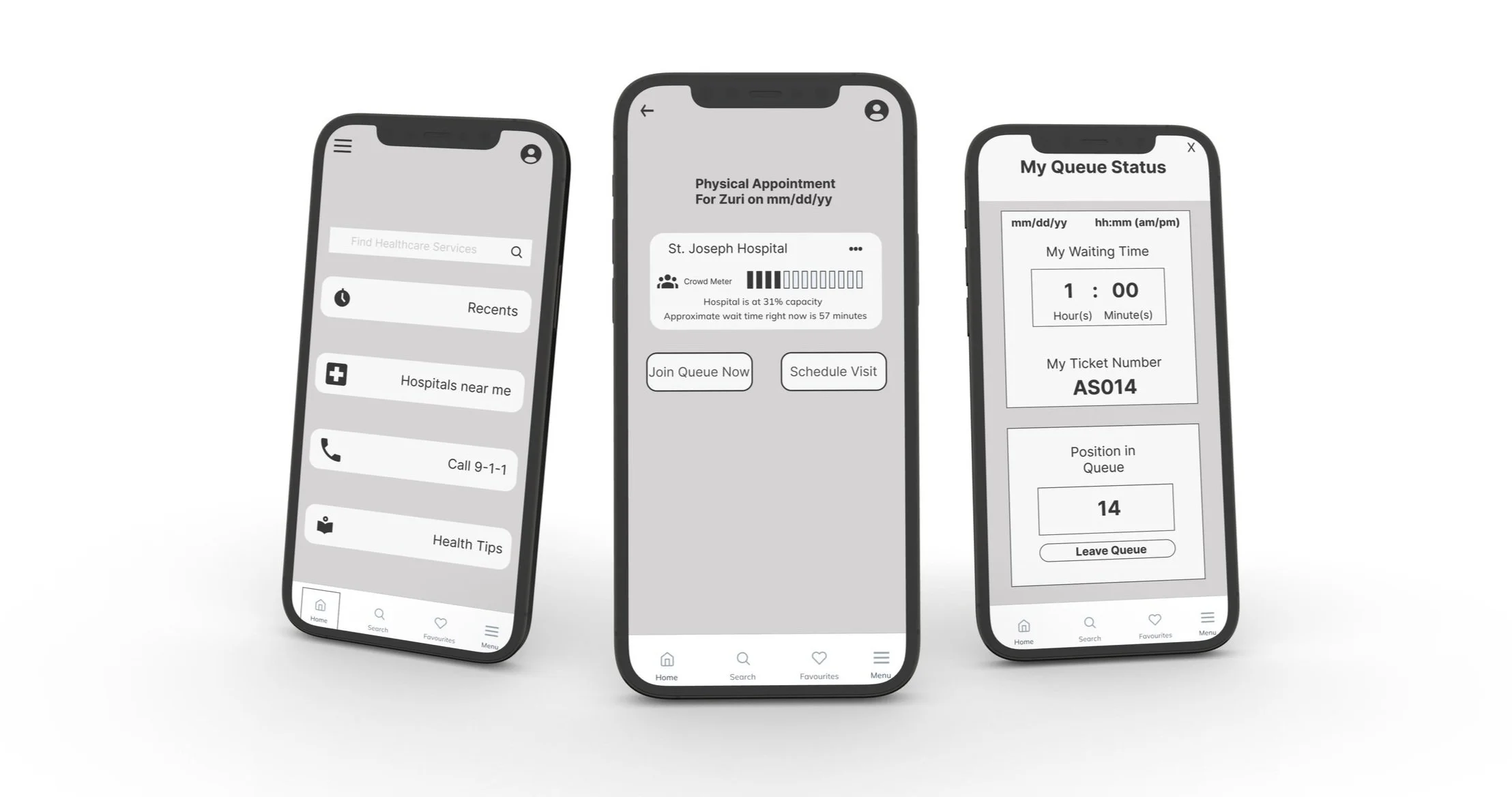
Using the Product
This digital product allows the user to find hospitals around them and sort the hospitals based on wait times, ratings, distance, etc. The problem space we are dealing with is the long wait time, so when a user finds the hospital with the least wait time, they can select it and see information about the hospital before selecting a virtual or physical appointment. Immediately, they can choose to join a virtual queue which gives real time information on how many people are ahead of them, the estimated wait time, their ticket number and an option to leave the queue.

Conclusion
Since this was a mid-fidelity project, I had to design within the instructions/constraints. The digital solution allows users to search and sort hospitals based on wait times and join virtual queues. The user was the focus of this project because all iterations and design decisions were taken based off user feedback and interview insights.
Key Learnings & Next Steps
Key Learnings
Designing within constraints/limits. This was a mid fidelity project and despite the ideas for a high fidelity product, I had to keep it at mid-fi as this was the requirement.
Designing for the user - All design decisions were made with the user in mind. The user testing and interviews birthed a lot of the major components and features of the digital solution
Accessible design for my app
Next Steps
I would like to eventually improve the fidelity of this app and hand it over to developers to bring it to life. I believe this will be a useful product.
I would like to add more functionality to the product and expand the features/abilities of the app.